Paris in Pink - Shooting Infrared in Paris
Paris in pink? It’s a camp divider I tell you; you may be reading this with a frown and thinking ‘surely not Clappy’, but then again you may be feeling this otherworldly render is something quite unique. Whichever way you look at it, I’ll tell you why I do this – I do it for my business and I do it for the ladies, yes you gorgeous.
Most blokes who buy or take photographs want images that witness a world on the edge. They want the sky to tear open and spill an inferno of fire onto the ground beneath. Mountains, icebergs, huge waves… danger and the impossible, but it’s not conducive on the walls of our homes, take note gents. On the other hand, most women want images that complement their home and lifestyle, thinking with a complimentary eye. Simple composition, fresh looking, simple and harmonious. Ok, that sounds patronising, not all women especially female photographers will take this approach, but over the last few years I have learned a thing or two about creating and selling images.
Lurking in B&Q
I was in B&Q the other day looking at pressure washers and ended up watching a young couple browsing canvases for their new home. Everything he picked out was dark – city skylines, NYC, big attention seeking rectangles that wont let go, doomed to be relegated to the garage in less than six months. She chose softer colours; flowers, abstracts and other simple images – squares in particular. He gave in (or shall we conclude he ‘agreed’), so they bought a print of an abstract painting and left content. But did he actually concede or did he stop being a ‘lad’ and finally ‘see sense’? I’ll leave you to compare this to your own shop-floor experiences. Whatever you conclude, the environment where we buy wall art or photography and the motive to buy often begins with a spot of weekend DIY.
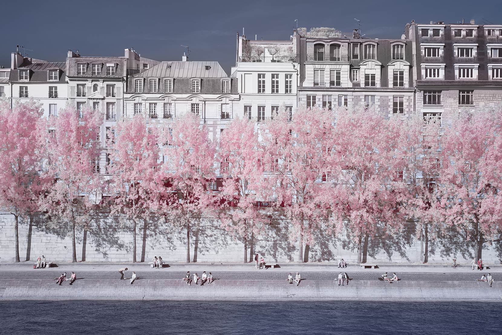
So what’s my point? My point is if you rewind the clock ten years to when I began my photography business in 2005, I never thought I would be making shots like this. Who would have thought I would prioritise photography in hard light, hand held with a camera that sees in a different frequency spectrum, so I can get home and turn trees pink in Photoshop. Originality within familiarity my friends. I am not sitting in a darkened room thinking of ways to shock the world, I’ll leave that to the students.
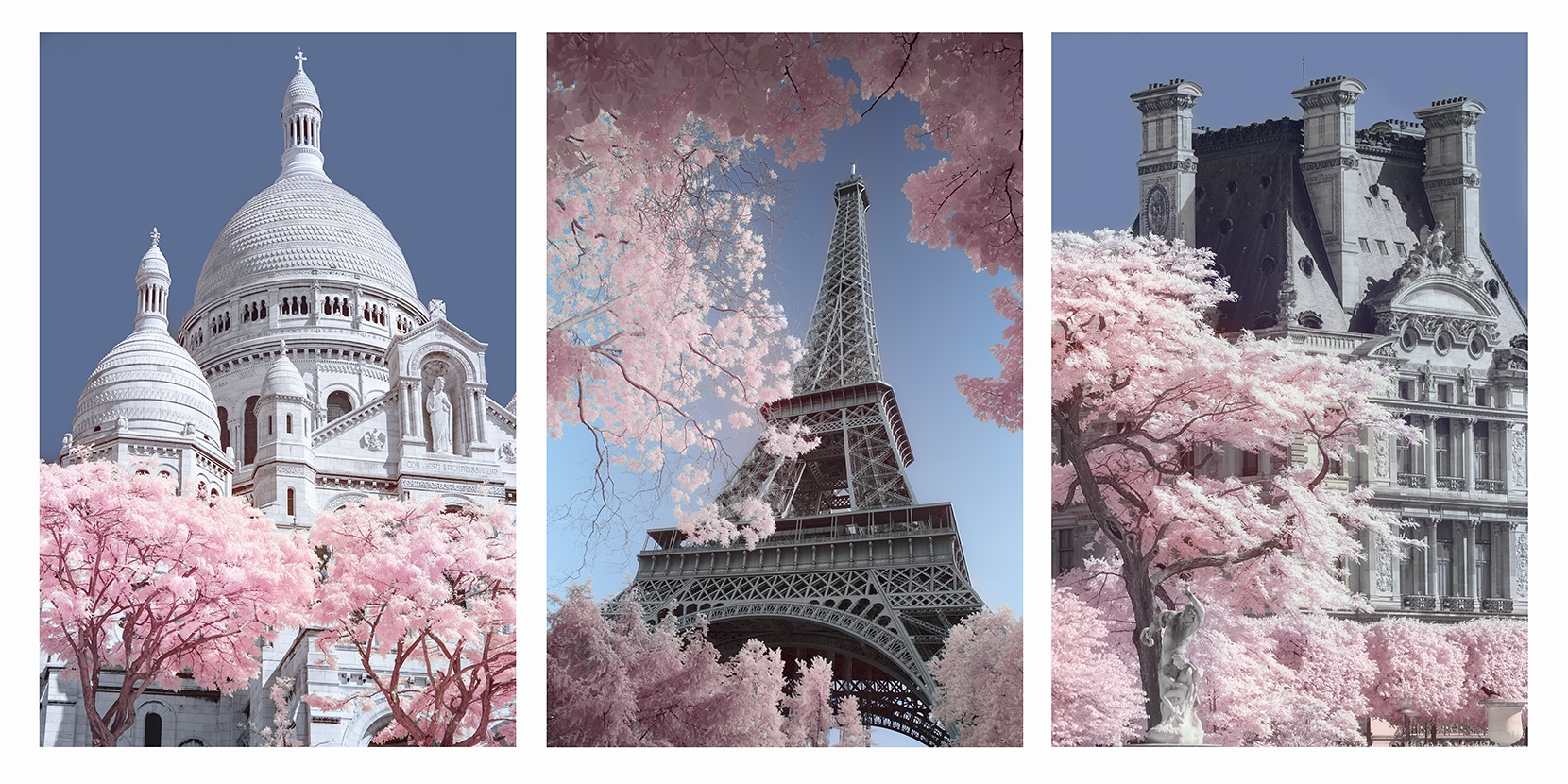
I highlight this point when giving talks to universities and colleges in particular - you observe the market and create for it; you don’t shoot for yourself and expect the market to come to you. It’s common sense really, but us blokes don’t like listening to it – we want adventure with our camera and our images, and there’s nothing wrong with that, but to succeed commercially within photography you need to look at the fundamentals - who sells, where they sell, who buys and more importantly why they decided to buy. I want our young couple to buy the middle one of the triptych above and then to think about getting the other two a week later. That’s good business.
So these pink trees are for you ladies – gentlemen I know you can see it too. They represent what I do commercially, but also and perhaps more importantly, my love of experimentation. So my message is simple - stay true, but then mix it all up - take some risks. You don’t have to reinvent the wheel – just remember, originality within familiarity – then your photography can continue to take an inventive and meaningful path.