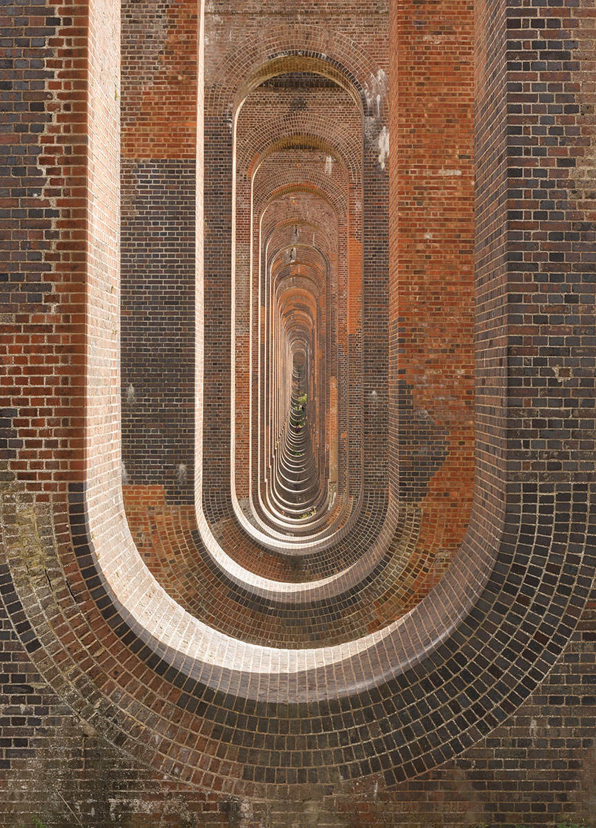
Infrared Photography Comparison at Balcombe Viaduct
After posting this image on social media, I thought that I would write a short article on comparing a colour Image, a black-and-white conversion of that colour image and an infrared image of the same composition.
The one thing that has always puzzled me, is whether infrared imagery is only added most effective when photographing the natural world. Including trees and foliage in imagery makes very obvious infrared look, but photographing something that is man-made should technically produce the same effect as a black-and-white conversion of a colour picture. You can clearly see in these examples that is not the case.
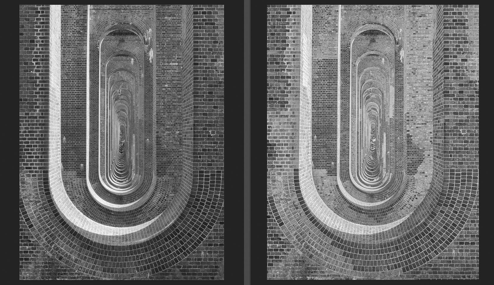
Here's the black and white conversion and the infrared black and white conversion side by side.
When I've worked out a way of making an HTML rollover, I will place it below.
If you analyse the luminosity you can clearly see the bricks are rendered entirely different way from the black-and-white conversion of the colour picture. There is unpredictable luminosity and brightness signature to the darker tones in particular. I took a lot of infrared imagery last year during my visit to the American deserts last year, but I never compared it with black-and-white conversions of colour images. This is clearly highlights that although many infrared photograhers believe the magic only lies when natural world subjects are included, there is a clear difference and tonal seperation. Personally, I find this intriguing and also a relief that infrared cameras will render a unique interpretation. Is this just because the subject matter was red? I'm not too sure....